


A new exhibition aims to tell the story of Japanese graphic design in a broader and more inclusive way than ever before.
Fracture: Japanese Graphic Design 1875–1975 has just opened in Tokyo, and is curated by American designer and writer Ian Lynam. He moved to Japan in 2005 to set up his own studio and became fascinated by the visual design history of his adopted home.
The show follows on from Lynam’s book of the same name, which was based on 15 years of research, and set out to produce the most “comprehensive and meaningful” study of Japanese graphic design history.
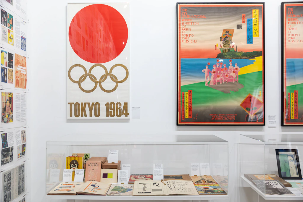
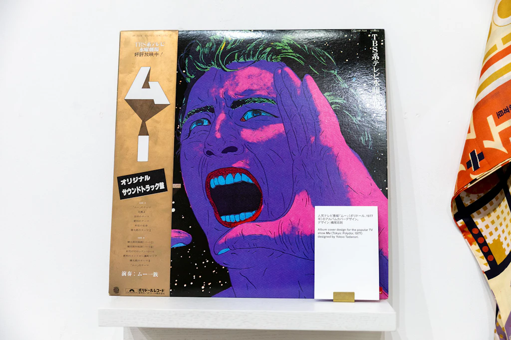
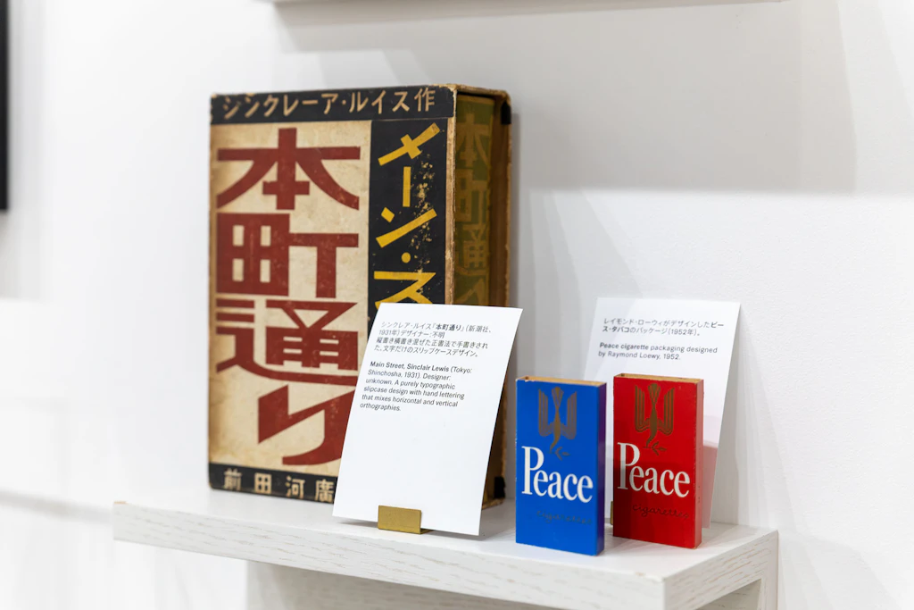
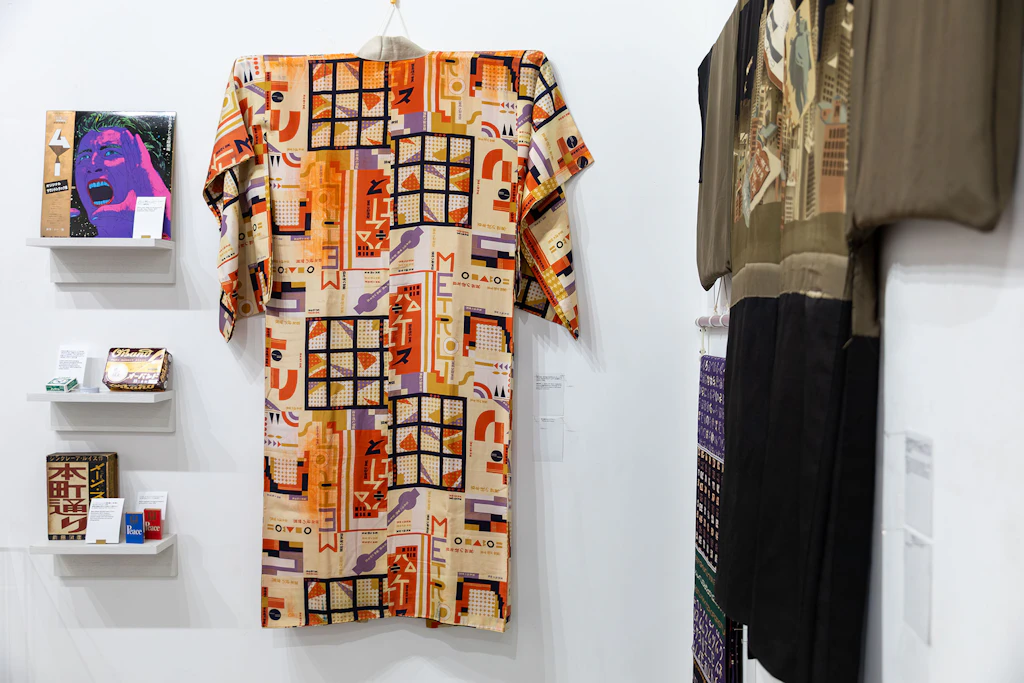
Both the book and the exhibition are remarkable for their eclecticism, featuring everything from Art Deco kimonos to the brand guidelines for the 1964 Tokyo Olympics, and radical feminist and LGBTQ+ publications to mass-produced objects, which show how design shaped people’s everyday lives.
We spoke to Lynam about the book, the show, and the current graphic design landscape in Japan.

What is the story you are trying to tell through the pieces you have chosen for this exhibition?
I tried to put together a set of artefacts that largely show graphic design as a cultural movement in a way that is bigger than just telling the story of modern advertising.
There are radical feminist journals, copies of Japan’s first mass-distributed gay magazine, student protest periodicals from the 1960s, propaganda comics and magazines from the inter-war period.


These are complemented by heaps of posters produced by anonymous designers from the early 20th Century, the first survey of modern colour theory in Japan, Japan’s first commercial art magazines, and type specimens and publications from Japan’s first commercial type foundry.
I’m trying to tell a story that is bigger than the one that is usually told, that only supports straight Japanese men – it is an inclusive, queer and feminist exhibition for everyone.
What are the key differences in the way Japanese graphic design evolved, compared to say the US or the UK?
Just looking at typography, Japanese is historically written or typeset top-to-bottom and right-to-left. Folks started typesetting things horizontally, then in the late 1800s they began typesetting things horizontally too, but from right-to-left to follow the original orthography.
After the Second World War, it became common to typeset things horizontally from left-to-right instead.
It has always been common to see vertical (tategaki) typesetting and horizontal typesetting (yokogaki) mixed together. It’s just a usual thing, whereas that mix would be considered pretty avant garde in the West.


Additionally, modern Japanese graphic design’s mass adoption of movable type happened later than in the West – though there were private presses that used movable type from China and Korea, as well as Japanese type early on.
And the adoption of photomechanical reproduction happened later due to Japan being closed to the rest of the world for 200+ years.
In counterpoint, graphic design that we’d consider postmodern – due to its complexity, contradiction, ambiguity and use of historical appropriation – occurred in Japan a dozen or so years prior to postmodernism emerging in Western Europe and North America.
Japan “modernised” – read Westernised – later, but postmodernised earlier.
Why was it important to include objects “plucked from daily life” in the show?
Graphic design is a form of cultural production wherein most folks don’t sign their work. I’ve included a number of posters which we don’t know who designed them, yet they are incredibly beautiful to look at.
These include two posters for retailers who sold wholesale used clothing – not the most glamorous subject, but the posters are fabulous.


Another example is O’band, one of Japan’s oldest and most popular brands of rubber bands.
That box rings nostalgic with most everyone who has seen it in the exhibition. It was designed in 1951 by Kansai’s leading designer, Imatake Shichiro, a person who really helped mould modern graphic design in Japan through his design work, as well as his involvement in graphic design organisations and exhibitions.
He founded the first independent graphic design studio in the Kansai region (Osaka, Kyoto and Kobe) and went on to operate a sister studio in Tokyo as well.
It’s just a box of rubber bands, but the design hasn’t really changed in over 70 years, and the person who made it helped turn graphic design into a more meaningful vocation after World War Two.
Were you surprised to find nobody else had published a book like yours documenting Japanese graphic design? Why did you want to rectify that?
Others had, but the one in Japan is a relatively thin one called A Century of Graphic Design グラフィックデザインの世紀 and the lone attempt at a survey of Japanese graphic design in English, The Graphic Spirit of Japan by Richard Thornton, is a book that I find deeply problematic.
Both books tell reductive, advertising-oriented histories of Japanese graphic design that exclude a lot of very important figures from history.


What is the biggest misconception people have about Japanese graphic design?
I think the biggest thing is the idea that the three writing systems – kanji, hiragana and katakana – sit inside invisible rectangles and the negative space on all sides affect their placement, whereas Latin type rests on an invisible baseline and it is that, combined with proper letter spacing, that makes Latin type easy to read.
It’s not a misconception so much as that the smallest units of graphic design operate fundamentally differently.
What is particularly interesting about the current graphic design scene in Japan?
I’m not sure that contemporary Japanese graphic design is particularly interesting in some ways beyond aesthetics, frankly.
Japanese design tends to look innately “Japanese” because the visual language is inherently different and there is such a rich history of references that folks outside of Japan are unfamiliar with.

Socially and culturally, commercially successful graphic design in Japan is still largely a boy’s club amongst popular designers with most big budget projects going to advertising agencies.
However, the democratisation of the tools of graphic design, and increased access to affordable means of production, have helped open up graphic design to underserved communities exponentially.
There are more recognised female graphic designers with their own studios working than ever before, but they continue to be the minority.
Fracture: Japanese Graphic Design 1875–1975 runs until July 26. More information is here.


Become a Design Week member for £4/month or £40/year
Already a member? Sign in.
link