
Beer By Design: The Graphic Designers

We’ve written plenty over the years about how beer comes to be – the ingredients, processes, innovations – but what about the final package: the can in your hand? What goes into bringing those colourful creations filling bottleshops to life?
In our Beer By Design series, we explore the various stages of the process from conception to the empty vessels waiting to be filled by brewers, as well as the people involved every step of the way. Having looked at the cutting edge of can-printing technology with Onpack, beer’s biggest trends and the artists bringing ideas to life, now it’s the turn of the graphic designers creating beer labels.
Designing beer labels must be a sweet gig. Choose some nice colours, maybe draw a picture, stick the brewery logo at the top, and you’re done. Don’t even need to do it by hand like in the old days – apparently it’s all on computers now.
Andy Hopkinson, who has worked on graphic design for the likes of Stone & Wood, Mountain Culture and First Light, certainly loves the work, including when he gets to pick up the pen.
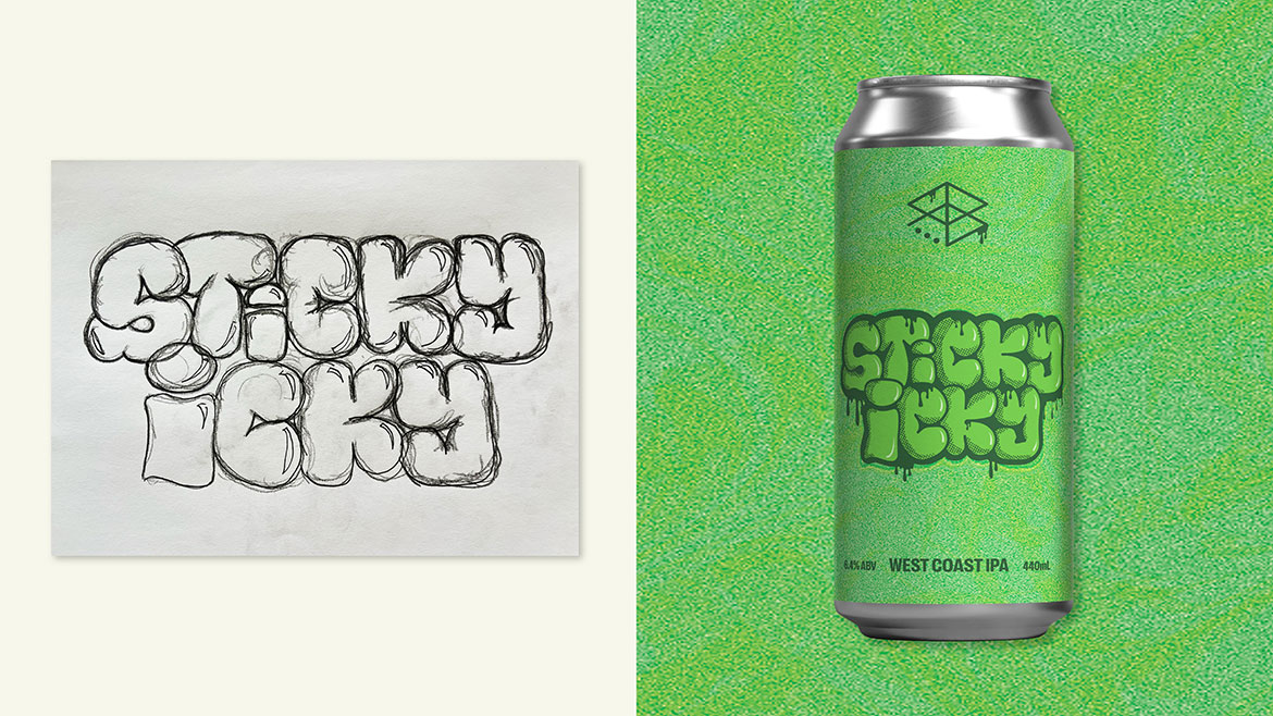
“I just did a can label for Range called Sticky Icky – that one was really fun,” Andy says. “I hadn’t properly gone and done hand drawn graffiti typography for ages, but that’s what that one called for.
“I used to draw stuff like that on my worksheets at school. I always remember teachers being like, ‘What are you doing? This isn’t going to get you anywhere.’ Well, it’s on a beer can now.”
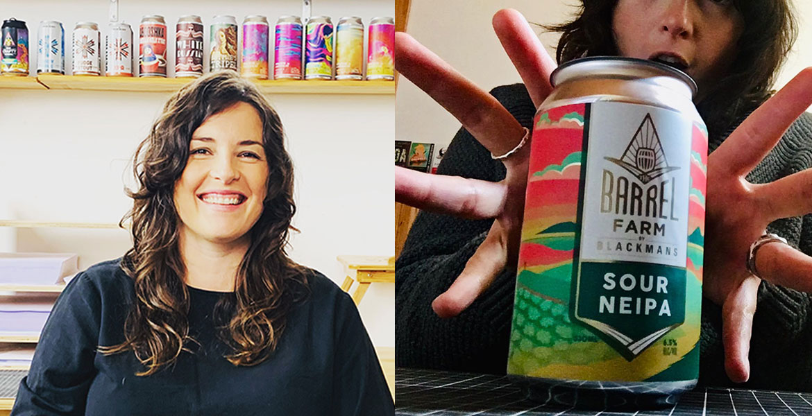
Jessie Jungalwalla, founder of Craft Instinct, has been designing for the booze industry for over a decade and still gets a kick out of it.
“So grateful I love what I do so much,” she says. “It would really suck if I hated it. It really fires up my engines. Fills my cup at the end of the day.”
Her passion is obvious as she talks about the international award-winning designs she’s created for Blackman’s Barrel Farm series, with their creative colours and “trippy landscapes”. And when asked about her design style, she speaks of her love of old industrial-era fonts, all things vintage, and her natural inclination towards bold, thick line work.
And yet Jessie says she doesn’t lean into her personal style all that often, because the labels she designs aren’t about her.
“There’s an interesting crossover with design, because it’s art, but it’s commercial art,” she says.
“Some designers forget they’re a commercial artist, and they’ll say, ‘Here is a fabulous design in my style, and I think it looks great!’
“Sometimes that works. But sometimes they’re not thinking about who’s buying the beer.”
It can be tempting for a creative to stamp their own style on everything they do, but when Jessie is designing a beer label, she’s not thinking about what appeals to her own personal taste, or even the personal taste of her brewery clients. She’s thinking about what appeals to the hypothetical customer in the bottleshop.
“It’s a really hard thing to design a beer for an audience that isn’t you,” she says. “We focus really heavily on that, because otherwise you just end up designing stuff you like and it doesn’t do the job of selling beer.”
With the availability of easy-to-use design software, including AI options, it can sometimes feel like anyone can be a graphic designer. Brewery owners working with a shoestring budget must sometimes wonder if they could make their own beer labels in Canva. Knock up a picture of a little hop dude, resist the urge to use Comic Sans. That’s about it, right?
Of course, there’s more to it than that. Jessie playfully describes label design as “pushing colours and shapes and fonts around the digital space until they look good enough to make people want to buy beer,” which sounds easy…
…until you think about that pesky little bit at the end: “good enough to make people want to buy beer.”
When a designer’s working on a beer label, they’re thinking about more than colours and fonts. They’re also thinking about market positioning and target audience and brand architecture. Because the end goal of a beer label isn’t just to look good – it’s to get people to buy beer. Specifically, to get people to buy that beer, even when it’s surrounded by hundreds of other beers on the shelf at the bottleshop.
It’s no easy task.
“You’ve got between one to three seconds – more like one second – to catch someone’s eye,” says Jessie. “And in that really small fraction of time, you’ve got to communicate who the brewery is, what the beer is, and what tribe the brewery comes from.”
Three seconds – if you’re lucky. How on earth do you design something that can capture people in three seconds?
It’s all about the time and thought you put in before those three seconds, like carefully setting up dominoes so when it’s finally time to knock them over, they fall in an intricate pattern. Or like in sports movies, where the game is paused with three seconds left on the clock, and the coach has time to come up with a plan for the winning play. In the case of beer label design, that plan is called brand strategy.
Jessie’s not only a graphic designer; she’s also a brand specialist. And for her, branding and design go hand in hand. Branding is setting up the dominoes; graphic design is knocking them down. Branding is the coach making a plan; graphic design is the players executing that plan to win the game.
Since founding Craft Instinct in 2016, Jessie has worked with a slew of breweries. You will have seen her designs on brewery logos, merch, event posters, curated Instagram grids, and a whole lot of beer labels. What you don’t see is all the branding work she did with each brewery first. Before Jessie puts pen to paper for a label design – or stylus to tablet, as it were – she works with the brewery to build a strategy based on what they want to achieve.
“The way we work is always looking at function before form. What’s the function of this label design? What’s our audience, who are we trying to attract? Is it going to be primarily placed in bottle shops close to the brewery, or do they have a wide distribution?”
A brewery’s answers to these questions will shape the strategy, and the strategy will shape Jessie’s designs. She can then use everything in her design arsenal – high contrast colours, or shapes and lines that lead the eye – to create a label that highlights what’s most important.
Let’s say a new brewery in Melbourne wants to distribute their beers interstate. Customers in a Brisbane bottleshop may never have heard of this brewery, and it’s hard to grab someone in those first three seconds with an unfamiliar logo. So Jessie would ensure their eyes land on something familiar first, before shifting their attention to the brewery name.
“We would usually go for beer style first in the visual hierarchy,” she says. “So really big ‘PALE ALE,’ and then the logo would be secondary to that.”
Another brewery may have hyperlocal focus, and only want to supply bottleshops in their immediate region. Their goal is to become a familiar name in the area and build a strong following with their community. In this case, the labels should function as a shining beacon for the brewery: the logo gets pride of place, calling to you from across the room, with the beer style coming second.
“People are wanting to support their brewery, or the local brewery that they’re visiting.”
Part of designing is remembering the basic rule of marketing: you can’t appeal to everyone. Labels need to stand out visually, but to be successful, they need to stand out to the right people. To Jessie, building a strategy begins with getting clear about the brewery’s target audience, which can include where people live, what demographic they’re in, or what subculture they’re involved with. Then it’s a matter of designing labels to catch their attention.
She uses Young Henrys as an example.
“Young Henrys have really captured a subculture of music and rock ’n’ roll,” she says, pointing out the microphones, amps, and vinyl records on their labels, and the consistent messaging across every part of their brand. “Even when they’re talking about sustainability, they’ve got dudes with long hair and tats.
“They’re signalling to people who are also part of that subculture, ‘We’re part of your tribe. You should buy our beer, because we understand you and you understand us.’”
The idea isn’t that you can only drink a beer if you vibe with a certain subculture. But if a brewery wants to focus on a particular kind of person – the creative crowd or the indie crowd, the trend-chasers or the straight-shooters – it’s the designer’s job to get inside their head and make labels that grab their attention. In one to three seconds.
She’ll encourage the brewery to create a profile of a specific ideal customer – complete with their background, their interests, and even a picture from the internet – to keep the brewery and designer alike focused on the customer’s taste, not their own.
“Remember, we’re designing for Lucy! We’re not designing for the brewers, we’re not designing for me or you – we’re designing this for Lucy. Would Lucy like this beer?”
The idea isn’t for breweries to be chameleons who’ll change to be whatever consumers want. In fact, Andy says it’s the opposite: drinkers connect with breweries that have a consistent, authentic brand.
“The brands need to be themselves,” he says. “It’s OK to hit trends sometimes, as long as it aligns with your brand, and your internal ‘why’.”
Andy has worked for different design agencies, as an in-house designer for Stone & Wood, and has run his own freelance outfit, Zero Nine Studio, since 2019. He loves to dig into the “why” for each brewery: its reason for existing, and why the people behind the brand do what they do. When he joined Stone & Wood as an in-house designer, he didn’t need to define their “why” – it was already clearly laid out – but he still needed to anchor each piece of design work in the brewery’s story.
Take the Hinterland Hazy label. As the first in a series focusing on all-Australian hops, it needed to look distinct from other beers in the brewery’s portfolio… but it still had to tie into the Stone & Wood aesthetic.
“Visually, it was very much about nature, it was about the hinterland: the hoop pines that exist there, the water and the ocean and the beach,” says Andy. “All very Stone & Wood, down to the core of what the brand is.”
Its same-but-different identity worked so well that when the brewery shifted Hinterland Hazy from limited release to core range, the label barely needed any changes in order to fit in – just a rearranging of which visual elements are most prominent.
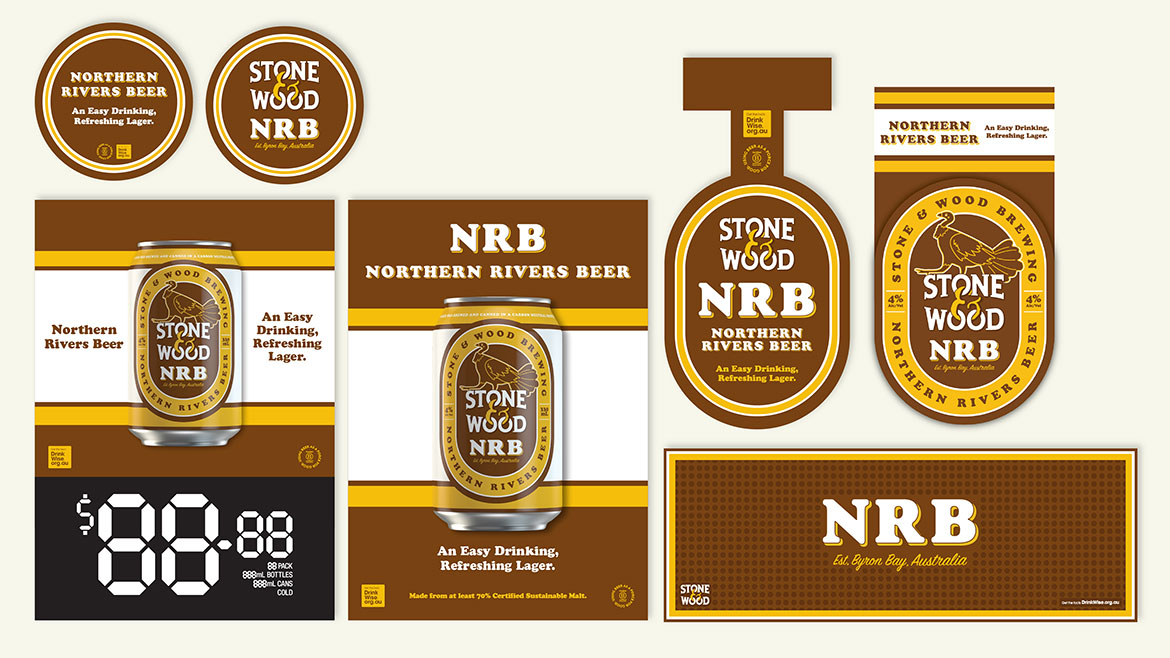
Then there’s Northern Rivers Beer, the straightforward lager promoting regenerative agriculture that needed to look completely different from Stone & Wood’s other beers. Andy and the team steered away from the organic, natural, Byron Bay aesthetic and dressed this clean, classic lager in a clean, classic label that wouldn’t be out of place with Aussie beer drinkers in the 80s. And yet NRB will never be confused for those other lagers, because right there on top of the logo is a proud nod to the Northern Rivers region: a brush turkey. It’s clear this isn’t just any lager – it’s a Stone & Wood lager.
Not every brewery has such a firmly-established brand as Stone & Wood, but every brewery has a “why.” When working on a freelance basis, one of the things Andy loves about his job is helping breweries articulate their story and show it off to the world.
He recently worked with First Light Brewing to build their brand from the ground up, which he describes as “the dream” for a designer.
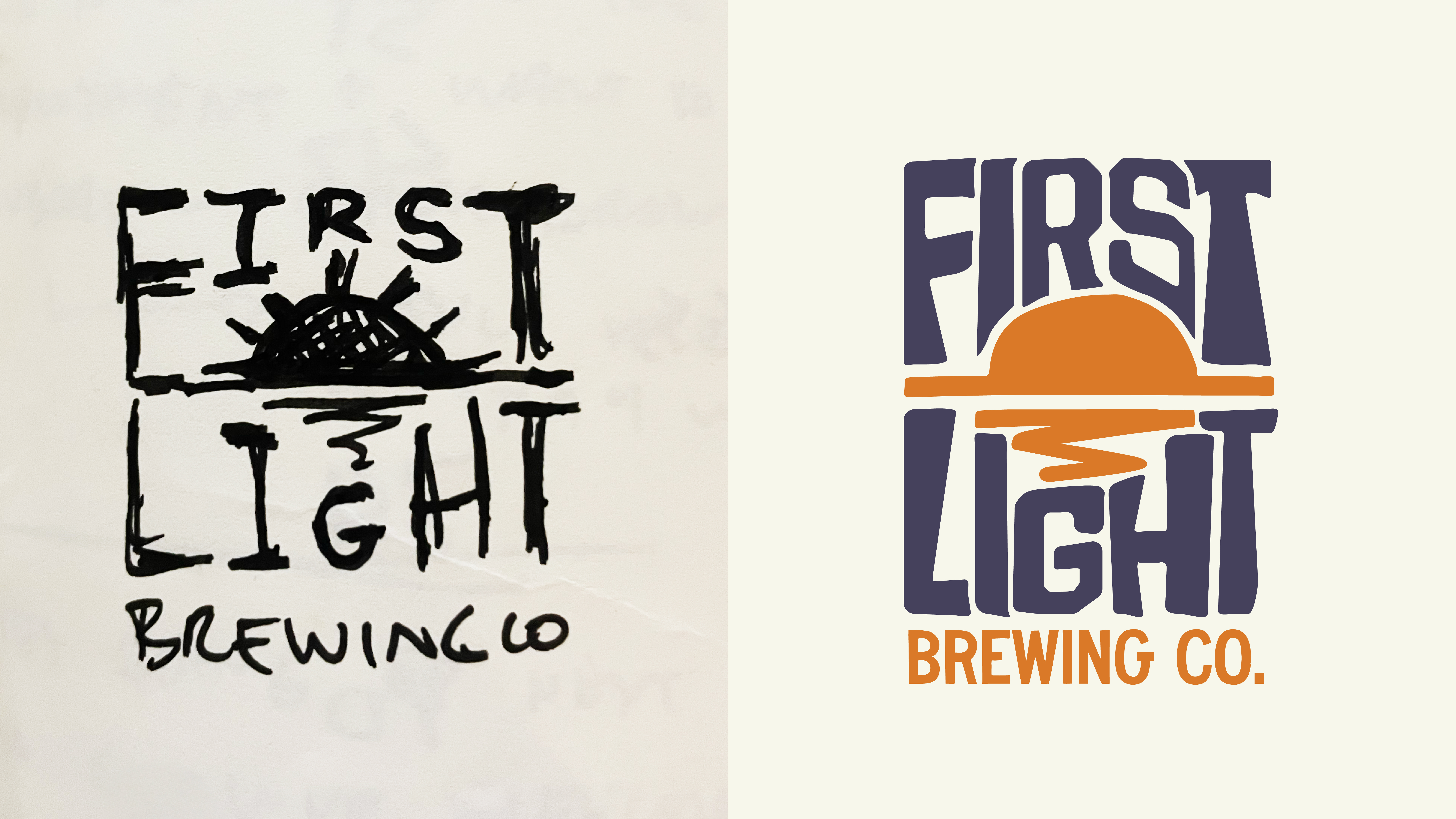
The founders’ wanted their brand to radiate one idea: “Own the day” – that simple success of waking up early, getting a bunch of work done, fitting in a surf or a bike ride, and ending the great day with a great beer. Andy helped broadcast that feeling on every core range can with a stylised sunrise, the brewery name writ large in laidback typography on a white background, and a simple beer style. No clutter. No fluff. No need to decode beer names.
When it came to the brewery’s first limited release, Cascade Range WCIPA, Andy designed a label that could act as a template to tick a number of boxes.
Easily distinguishable from the regular lineup: it has a black background, and replaces the stylised sunset with a circular badge containing a stylised mountain range.
Clearly anchored in the values and lifestyle of First Light and its drinkers: “Because these limiteds are meant to be for the adventurous [who are] looking for something different, we were building on this badge system – like those badges you get from national parks, or scout badges. You get one when you’ve done something.”
Flexible enough to be used for any and all future limited releases the brewery might make: “This one happened to be Cascade Range, based around a mountain range… but the next limited could be a peach sour. And that badge could still work; I could create whatever within that badge.”
So is beer label design all just pushing colours and shapes around?
Well, the colours do matter. Have you ever considered how hard it is to design a label for a dark beer without using dark colours? Or how using pinks and purples on a non-fruit beer can give people a false expectation of fruitiness? Jessie has to consider these things.
And the shapes matter. Have you ever thought about how many traditional beer labels feature a circle or oval symbol?* (Think VB, Fosters, Coopers… and NRB.) Andy thinks about this.
Even the way the cans are printed matters. If plate printing is involved (which many breweries use for core range beers), the label can only contain a maximum of six colours. Kind of important information for a graphic designer.
And we didn’t even get to talking about the ever-growing amount of information legally required to be included on beer labels. Whose job do you think it is to squeeze that in?
It’s a good thing graphic designers seem to enjoy making beer labels, ‘cause it’s a helluva job.
*It’s called a roundel.
About Mick

Mick Wüst is the author of the book Beer Drinker’s Toolkit, a fun and approachable guide to beer. He’s also a freelance copywriter for the beer industry. You can find him on Instagram as Schoonerversity.
The beer(s) or moment(s) that turned you on to good beer:
I’m sure I’d had good beers before this, but the first barrel-aged imperial stout I ever tried made me feel like Popeye with spinach.
You’ve got three beers to turn someone else on to good beer; what are they and why?
- Balter XPA
- Wayward Raspberry Berliner Weisse
- Boatrocker Ramjet
The last beer you enjoyed:
A IIPA from Woopi Brewing that tasted like fruit salad and resin.
Three things that represent you:
- Book – World War Z (seriously, give it a go – it’s better than it sounds)
- Travel – Greece
- Food – all the bread and hot chips
link


