Ten branding schemes by students at The Graphic Design School
Dezeen School Shows: the rebranded identity of a sushi restaurant that was impacted by closures during the Covid 19 pandemic is included in Dezeen’s latest school show by students at The Graphic Design School.
Also featured brand identity scheme for a company specialising in outdoor footwear and a campaign that aims to help raise awareness about dwindling bee populations.
Institution: The Graphic Design School
Course: CUA40720 Certificate IV in Design
School statement:
“The CUA40720 Certificate IV in Design course is a comprehensive graphic design qualification designed for those who aspire to become skilled designers.
“This online and intensive course covers 12 modules, focusing on a blend of ‘old school’ and ‘new school’ techniques, ensuring a deep understanding of design culture and practical skills.
“Whether you seek a formal qualification or prefer to enhance your skills, this course offers flexibility.
“The course is self-paced, allowing students up to 15 months to complete.”
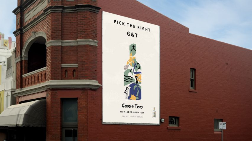

Good and Tasty by Zoe Morton
“In an ever-growing non-alcoholic drinks industry, I embarked on a journey to craft something that truly captures the essence of enjoying life without the need for alcohol.
“This project is all about communicating the idea that choosing non-alcoholic beverages allows you to have the best of both worlds – having fun in the evening and waking up early in the morning for activities like surfing or hiking without the burden of a hangover.
“To bring this concept to life, I employed bold and playful hand-drawn elements throughout the branding, aiming to convey the feel-good experience of consuming non-alcoholic drinks.”
Student: Zoe Morton
Course: CUA40720 Certificate IV in Design
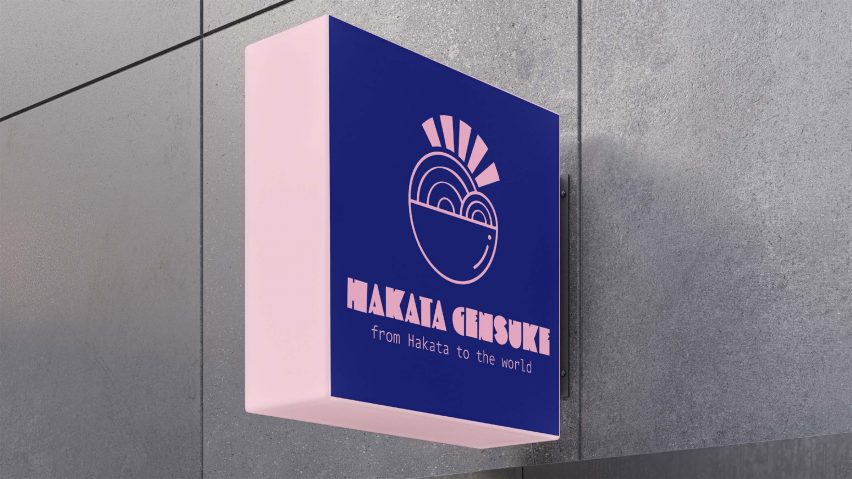

Hakata Gensuke by Aimee Li
“The goal for this project was to create a contemporary logo for an established ramen restaurant. The bold pictograph logo aims to attract new customers while retaining the restaurant’s Japanese origins and authenticity.
“The imperfect noodle spacing in the logo reflects homemade and authentic qualities. I chose appetite-stimulating colours for vibrancy, nodding to Japan’s cultural symbolism.”
Student: Aimee Li
Course: CUA40720 Certificate IV in Design
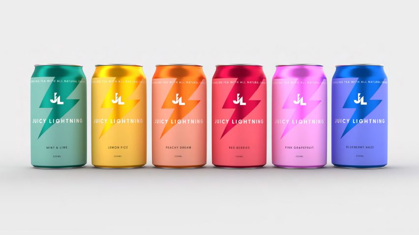

Juicy Lightning by Pia Rawlins
“The Juicy Lightning product line was designed to appeal to casual energy drink consumers seeking lower sugar content and more natural flavours and ingredients.
“This target audience is health-conscious and often prefers organic products when available. The colour palette comprises bright and pleasant pastels, creating an aesthetically pleasing rainbow effect.”
Student: Pia Rawlins
Course: CUA40720 Certificate IV in Design
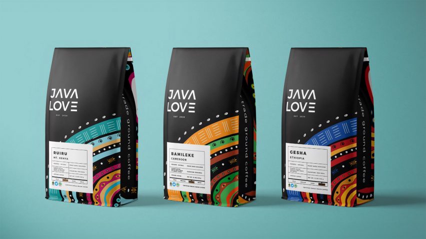

Java Love by Angel Nicholson
“The goal of this project was to create a new, repurposed logo and identity that would enable the Kenyan coffee company, Java Love, to compete effectively in the retail environment.
“They aim to blend in on shelves with their competitors while retaining the authentic Kenyan spirit of their brand.”
Student: Angel Nicholson
Course: CUA40720 Certificate IV in Design


Rizen by Cherise Vecchio
“Based on the East Coast of Australia, Rizen offers botanical solutions as a natural alternative for pain relief and comfort.
“Unlike similar brands in the market, Rizen breaks away from typical branding, aiming for an elevated, high-end presence.”
Student: Cherise Vecchio
Course: CUA40720 Certificate IV in Design
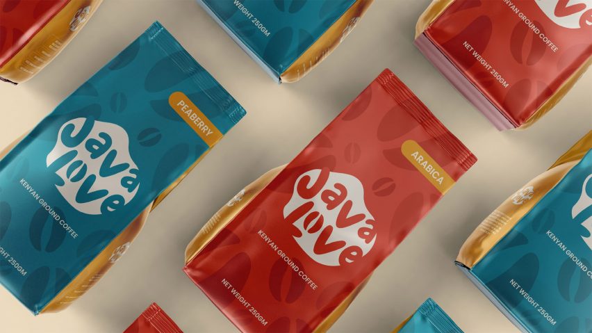

Java Love by Alana Rose Mercuri
“I aimed to create a harmonious, bold, and vibrant packaging design concept for a Kenyan coffee brand.
“This concept would be applied to a range of products, including ground coffee bags, compostable takeaway cups, paper bags and coasters.”
Student: Alana Rose Mercuri
Course: CUA40720 Certificate IV in Design
Email: heynana.design[at]gmail.com
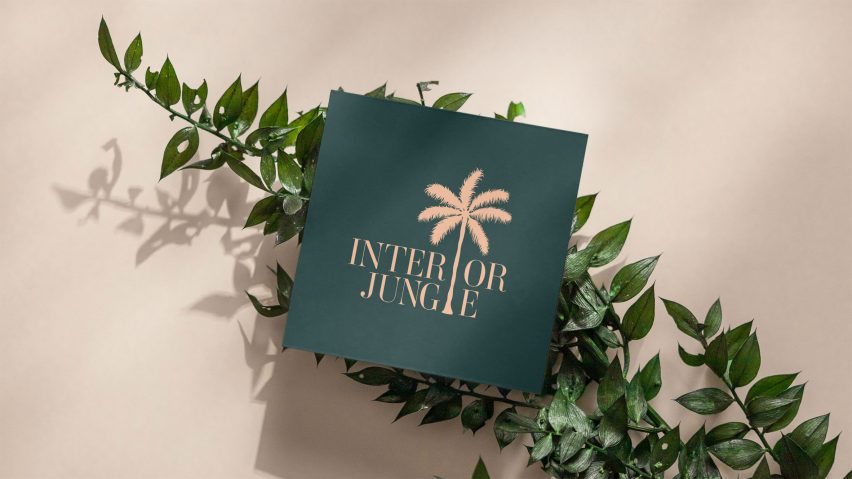

Interior Jungle by Michelle Ritchie
“This project focused on the brand identity, print and layout design for Interior Jungle, a UK-based startup offering professional interior design services.
“Like a jungle, interior design can be overwhelming. The brand identity takes inspiration from tropical jungles, reflecting the values of elegance, professionalism and fun.”
Student: Michelle Ritchie
Course: CUA40720 Certificate IV in Design
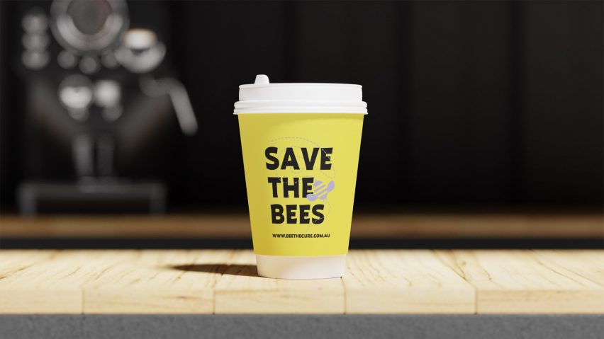

Bee the Cure by Pamela Cook
“Bee the Cure is a campaign about saving the honeybee from extermination. By creating striking posters and billboards, I aimed to capture attention and spread awareness.
“Physical products like coffee cups, tote bags and t-shirts help to expand the campaign’s reach.”
Student: Pamela Cook
Course: CUA40720 Certificate IV in Design
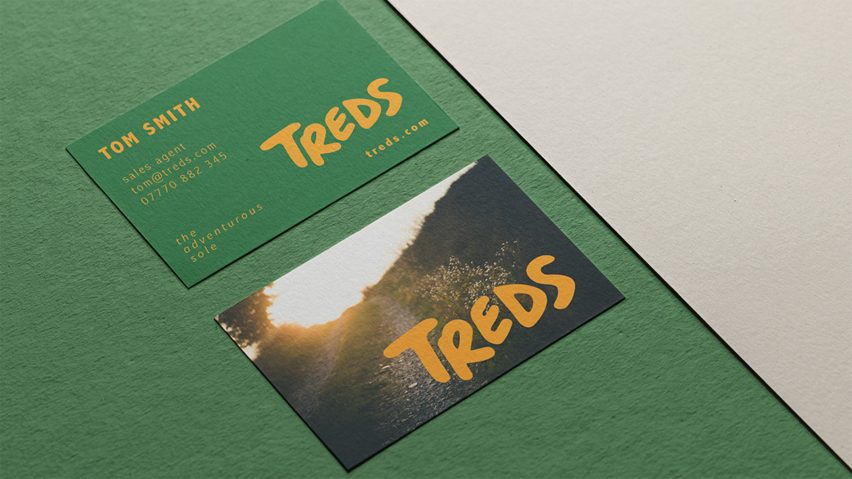

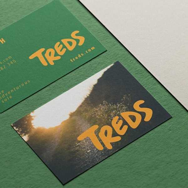
Treds by Siana Thompson
“Treds is a fresh e-commerce venture specialising in stylish and robust outdoor footwear. The logo features striking, contrasting colours and dynamic elements to symbolise movement and walking.
“I have selected an organic typeface to set the brand apart from competitors who tend to use traditional fonts.”
Student: Siana Thompson
Course: CUA40720 Certificate IV in Design
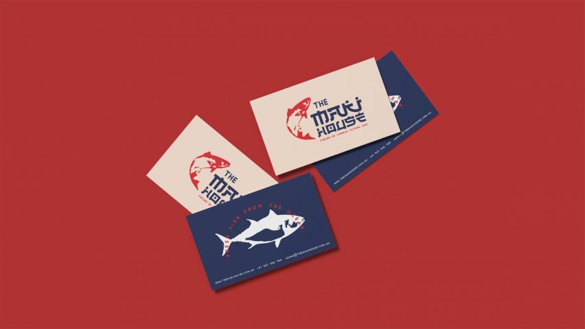

The Maki House by Gib Phimong
“This project proposes a visual identity design scheme for a sushi restaurant named The Maki House. After a challenging closure during the pandemic, The Maki House is ready to welcome sushi enthusiasts once more.
“Before their eagerly awaited grand reopening, they sought a much-needed facelift to rejuvenate their brand.”
Student: Gib Phimong
Course: CUA40720 Certificate IV in Design
Partnership content
This school show is a partnership between Dezeen and The Graphic Design School. Find out more about Dezeen partnership content here.
link


